© Florence Knights
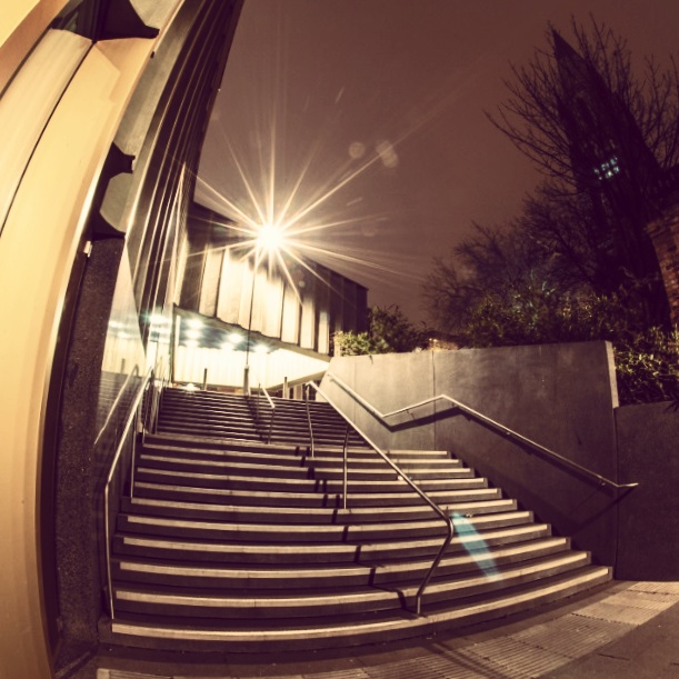
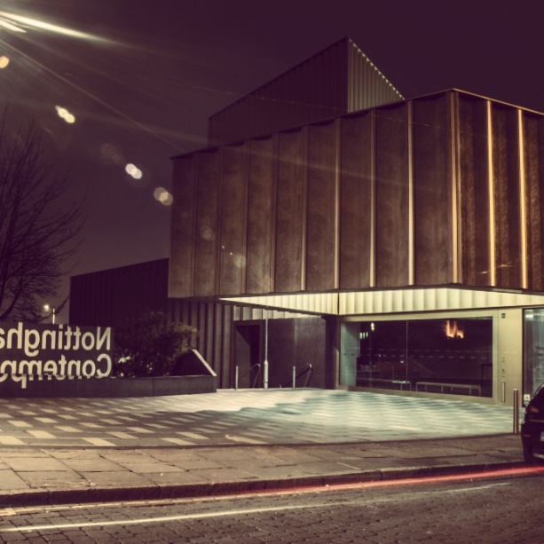
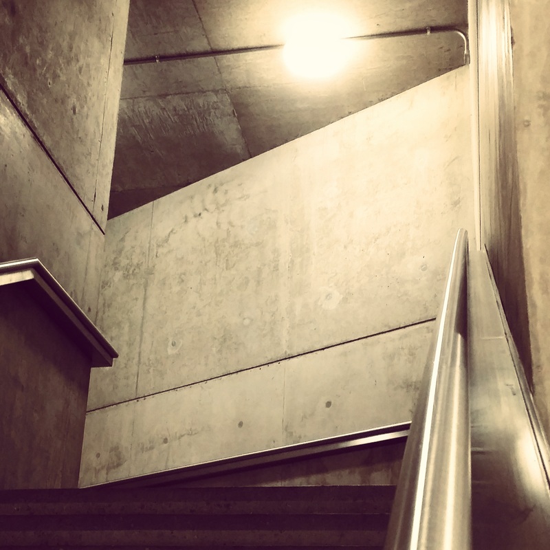
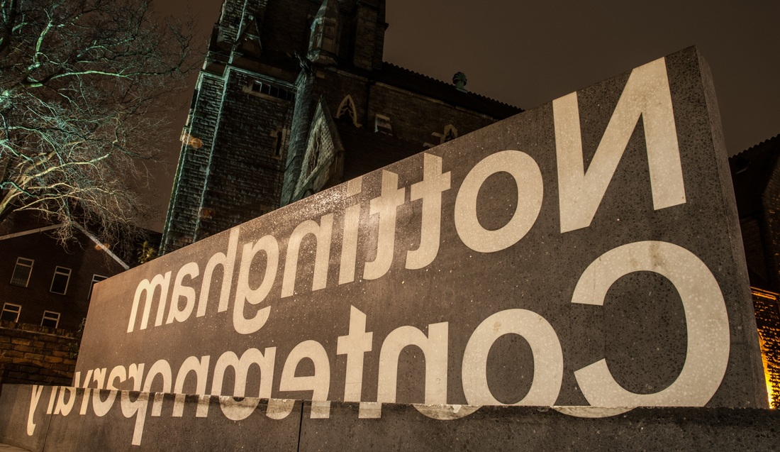
Nottingham Contemporary was built in 2009 & designed by Caruso St John Architects. Although the project was a new build, the architects wanted it to feel more like a converted factory or warehouse, & this is reflected in its variety of spacious interiors.
There is very little furniture present in the gallery, but the majority of exhibitions are on the wall at eye level, so I don't find this too inconvenient. However, it does discourage people from spending extra time in the gallery, to sketch or simply admire the exhibitions. The circulation of the exhibits feels clear & natural, but they are split into three separate rooms which means you have to come out into the lobby before moving on to the next room. It's not a huge inconvenience, but it breaks up the flow of movement & feels a bit awkward.
The separation of the exhibits feels like a missed opportunity. Partition walls could have created a more flexible exhibition space, allowing for more continuous movement, while also keeping the option to close off one or two of the rooms while new exhibitions are installed.
Inspired primarily by the artists' spaces of downtown New York in the 1960s, the gallery doesn't immediately appear to fit into the context of the historical Lace Market. However, if you look closer, you'll notice that the building's irregular shape is dictated by the contours of the land & the facade's concrete cladding incorporates a 19th Century Nottingham lace design.
http://www.carusostjohn.com/projects/nottingham-contemporary/
http://www.louisewestlacedesign.co.uk/gallery/nottingham-contemporary
http://www.louisewestlacedesign.co.uk/gallery/nottingham-contemporary
